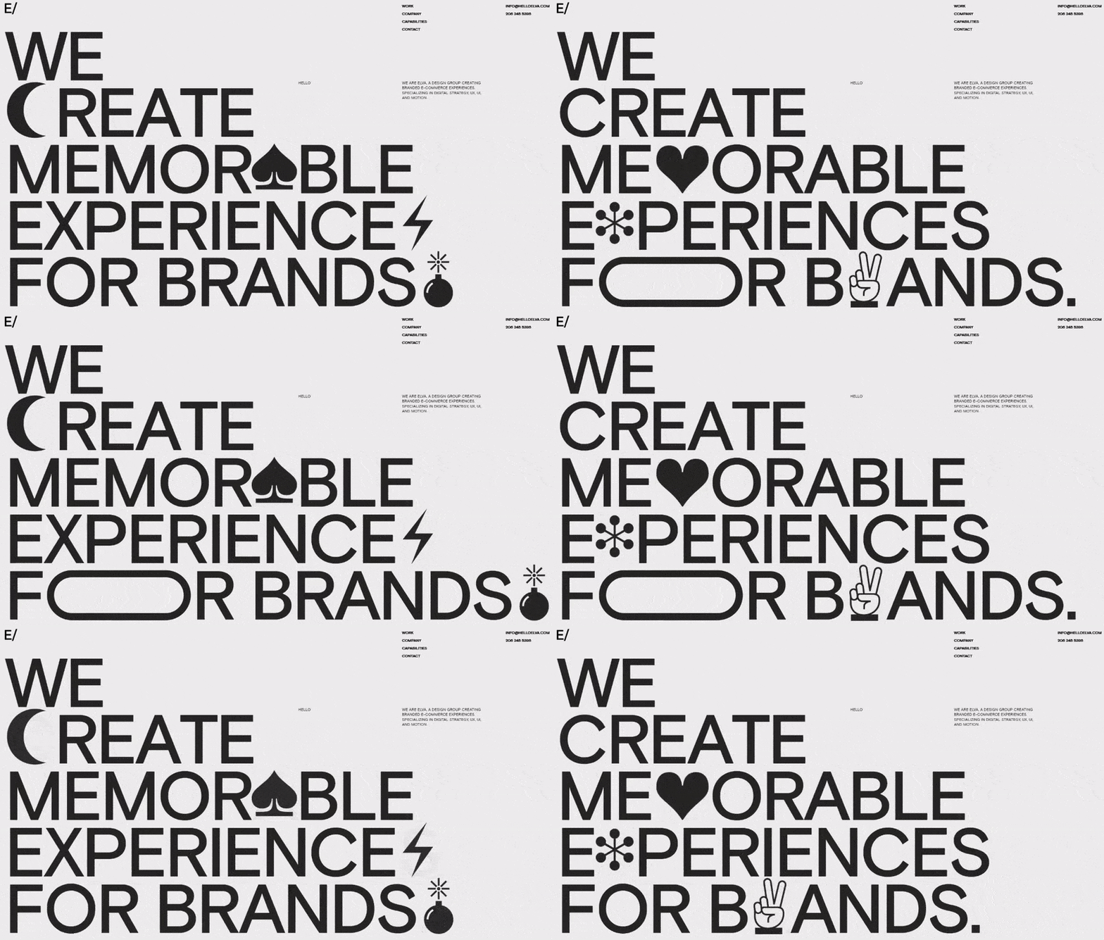
Shop At Haya: Your Ultimate Shopping Guide
Discover the best shopping tips, trends, and deals for a smarter buying experience.
Typefaces That Speak Louder Than Words
Discover typefaces that convey powerful messages—unleash the art of design and elevate your communication beyond words!
The Psychology of Typefaces: How Font Choices Affect Perception
The psychology of typefaces plays a crucial role in how audiences perceive information. Different fonts convey various emotions and attitudes; for instance, serif fonts like Times New Roman often evoke feelings of tradition and reliability, making them ideal for formal communication. In contrast, sans-serif fonts like Helvetica exude modernity and minimalism, appealing to younger demographics. Moreover, typography can influence readability and focus, with some research indicating that readers find sans-serif fonts easier to read on digital screens, while serif fonts may aid in better comprehension in printed materials.
When selecting a font, it’s essential to consider the impact of font choices on branding and messaging. A playful font like Comic Sans might suggest a casual and approachable atmosphere, but it could also risk undermining seriousness in professional contexts. On the other hand, a font like Garamond can enhance the sense of sophistication and elegance, making it a favorite among luxury brands. Ultimately, understanding the psychological effects of typefaces can empower content creators to make informed decisions that align with their audience's perceptions and expectations.

10 Iconic Typefaces and Their Impact on Branding
Typography plays a crucial role in branding, as the right typeface can effectively convey a company's identity and values. Iconic typefaces like Helvetica and Garamond have not only become staples in the design community but have also shaped the visual landscape of brands around the world. For example, Helvetica, known for its clean and modern aesthetic, has been employed by major corporations such as American Airlines and BMW to project reliability and professionalism. On the other hand, Garamond, with its classic and elegant design, is frequently used in publishing houses, as it evokes a sense of tradition and quality.
In addition to Helvetica and Garamond, other iconic typefaces like Futura and Times New Roman have significantly influenced branding strategies. Futura, with its geometric shapes, is often associated with forward-thinking brands, making it a popular choice in the tech industry. Meanwhile, Times New Roman, originally designed for newspapers, has been adopted by numerous organizations that wish to present an authoritative image. The impact of these typefaces on branding cannot be overstated; they not only enhance visual appeal but also communicate key messages about a brand’s personality and ethos.
What Makes a Typeface Effective for Communication?
When it comes to effective communication, the choice of typeface plays a crucial role. A well-designed typeface enhances readability, ensuring that the message is conveyed clearly and efficiently. Factors such as font size, letter spacing, and line height contribute to how easily a reader can process information. For instance, sans-serif typefaces like Arial or Helvetica are often favored for digital content due to their clean lines, while serif typefaces such as Times New Roman may be more appropriate for printed materials due to their tradition and formality.
Additionally, the emotional tone of a typeface can significantly influence the perception of the message being communicated. Certain typefaces can evoke specific feelings or associations; for example, a bold and rounded typeface may communicate friendliness and approachability, while a sharp and angular typeface could signal modernity and professionalism. Therefore, understanding the audience and the context is essential when selecting a typeface, as it can ultimately dictate the effectiveness of the communication strategy.