Shop At Haya: Your Ultimate Shopping Guide
Discover the best shopping tips, trends, and deals for a smarter buying experience.
Type Tales: Fonts That Speak Louder Than Words
Discover the power of typography with Type Tales! Uncover fonts that make a statement and transform your design game today!
The Psychology of Fonts: How Typeface Choices Influence Perception
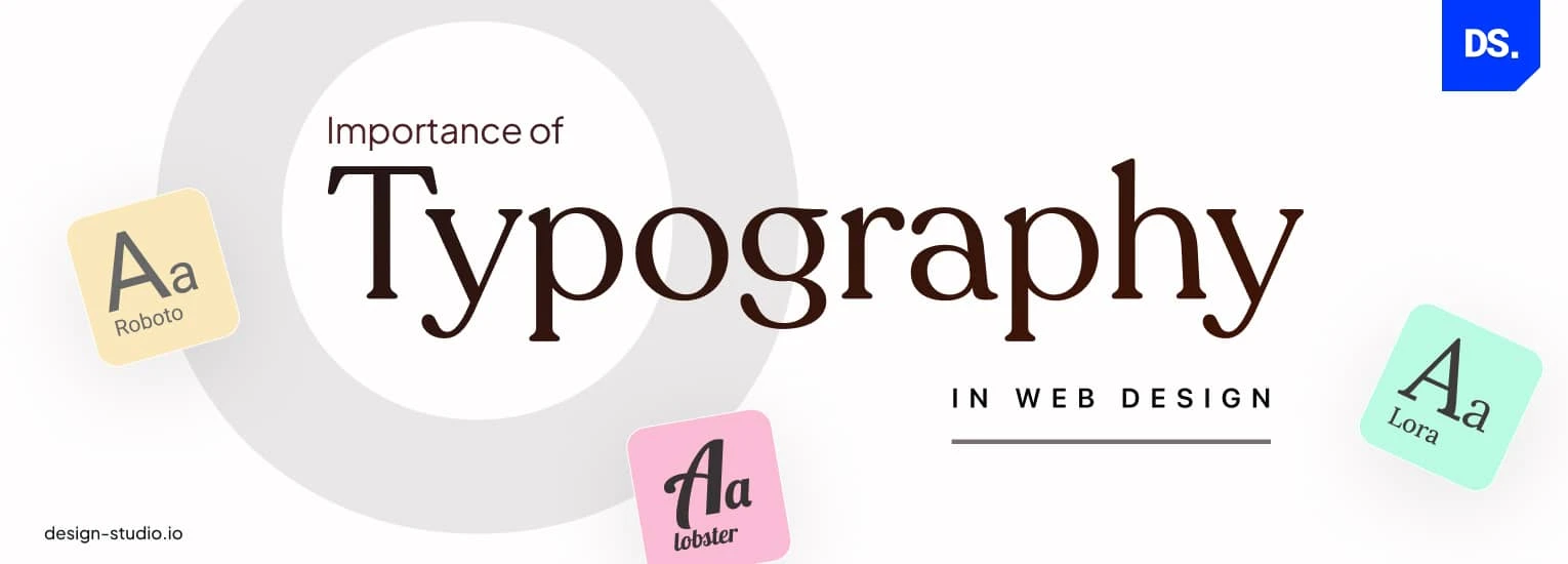
The choice of typeface can significantly impact how a message is received and interpreted by an audience. Different fonts evoke different emotions and associations; for instance, a sleek, modern sans-serif font may convey cleanliness and innovation, whereas a traditional serif font might suggest reliability and timelessness. Research in the field of psychology has shown that these visual cues influence not just aesthetic preference but also the perceived credibility and authority of the text. Brands often employ specific fonts to align their identity with their values and to resonate with their target audience.
Moreover, the psychology of fonts extends beyond mere aesthetics. Studies indicate that certain typefaces can affect reading comprehension and retention. For example, a study found that using a readable font can enhance learning outcomes in educational materials. The emotional response to font choices can also drive consumer behavior; people are more likely to trust a company that uses fonts they find appealing and relatable. Thus, understanding the subtle yet powerful effects of typeface on perception can be an invaluable tool in branding, marketing, and content creation.

10 Iconic Fonts and the Stories Behind Them
Fonts are more than just letters on a page; they carry stories that reflect the culture and advancements of their time. In this article, we delve into 10 iconic fonts that have not only defined the visual identity of their eras but also influence modern design. These fonts range from the classic Helvetica, known for its clean and modern lines, to the whimsical Comic Sans, which sparked debates over appropriateness in design. Each font carries with it a tale of its creation, the designer's vision, and how its use has evolved over time.
Take, for instance, Times New Roman, the quintessential newspaper font designed in 1931 for The Times of London. Initially crafted for readability, it quickly became synonymous with traditional print media. In contrast, Futura, designed by Paul Renner in the 1920s, was inspired by geometric shapes and the modernist ethos, symbolizing the future of design. As we explore these fonts, we uncover not just their aesthetic appeal but also how they echo societal shifts and technological innovations that have shaped typography as we know it today.
Can Fonts Really Change the Way We Perceive a Message?
The impact of fonts on our perception of a message is often underestimated. Various studies have shown that the typography used can significantly influence the way information is interpreted. For instance, a study revealed that using a bold, sans-serif font tends to convey a sense of urgency or importance, while a cursive font may evoke feelings of warmth and nostalgia. The emotional response triggered by different styles can steer the audience's reaction, making it crucial for marketers and content creators to consider font choices carefully.
Moreover, the legibility of a font plays a vital role in communication. A well-chosen font enhances readability, ensuring that the message is not only seen but also understood quickly. For example, fonts like Arial or Helvetica are often preferred for digital content due to their clarity. Conversely, overly decorative or difficult-to-read fonts can hinder comprehension, leading to disengagement. Thus, when crafting content, it’s essential to recognize that the aesthetic and functional aspects of typography can dramatically shape the audience's perception and retention of the message.