Shop At Haya: Your Ultimate Shopping Guide
Discover the best shopping tips, trends, and deals for a smarter buying experience.
Fonts That Make or Break Your Site
Discover the fonts that can elevate your website or drive visitors away! Find out which styles make the difference now.
Discover the Best Fonts to Elevate Your Website's Aesthetic
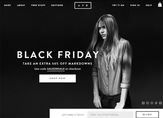
Choosing the right fonts is crucial to enhance your website's aesthetic and overall user experience. With countless options available, it can be overwhelming to decide which fonts will best convey your brand's message. One popular choice is Google Fonts, which offers a wide variety of free, customizable typefaces. When selecting fonts, consider pairing a clean sans-serif for headings with a more traditional serif for body text to create a harmonious balance that guides the reader's attention.
Remember, typography is an essential element of your website's design. To assist you in finding the perfect combination, here are some recommendations for fonts that can elevate your website's aesthetic:
- Montserrat – A modern geometric sans-serif that works well for headings.
- Roboto – A versatile and easy-to-read font ideal for body text.
- Lora – A classic serif font that adds a touch of elegance.
- Open Sans – A humanist sans-serif typeface that is friendly and approachable.

How the Right Typography Can Influence User Engagement
When it comes to website design, typography plays a crucial role in shaping user experience and engagement. The right combination of fonts, sizes, and styles can significantly affect how users perceive and interact with your content. For instance, employing a clear and legible font can enhance readability, leading to longer time spent on a page. On the other hand, using too many competing fonts or styles can create visual clutter, making it challenging for users to focus on the message. It’s essential to strike a balance that ensures a seamless reading experience.
Moreover, typography can evoke emotions and set the tone for your brand. Consider how different fonts can influence the overall feel of your website; a playful handwritten font might attract a younger audience, while a sleek serif font could appeal to a more professional demographic. To optimize user engagement, it’s vital to choose typography that aligns with your brand identity. Additionally, incorporating accessible typography design practices, like proper line spacing and contrast, can make your content accessible to a broader audience, thereby boosting user retention and engagement.
What Fonts Should You Avoid to Prevent a Poor User Experience?
When it comes to web design and content presentation, fonts play a crucial role in user experience. Certain fonts can hinder readability and distract visitors from your message. For instance, avoid using overly decorative fonts like Comic Sans or Papyrus. These fonts often appear unprofessional and can create a sense of disorganization. Additionally, fonts with excessive flair or intricate details, such as Curlz MT or Algerian, can make it difficult for users to concentrate on the text, leading to a frustrating experience.
Another type of font to steer clear of is the thin or lightweight fonts, particularly on digital screens. Fonts such as Helvetica Neue Ultra Light or Arial Narrow can become hard to read, especially in smaller sizes or low-contrast situations. Always prioritize legibility and clarity over aesthetics. A good practice is to stick to web-safe fonts like Arial, Verdana, or Georgia that offer both style and usability, ensuring your content is accessible and enjoyable for all users.