Shop At Haya: Your Ultimate Shopping Guide
Discover the best shopping tips, trends, and deals for a smarter buying experience.
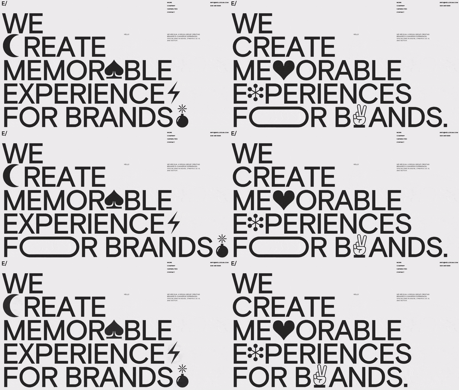
Typefaces that Turn Heads: Elevate Your Web Design Game
Discover typefaces that captivate and transform your web design. Elevate your aesthetic and leave a lasting impression today!
Top 10 Typefaces That Will Make Your Website Stand Out
Choosing the right typeface is essential for creating a visually appealing website that captures your audience's attention. Here are the Top 10 Typefaces That Will Make Your Website Stand Out:
- Montserrat - A modern and versatile sans-serif that exudes professionalism.
- Playfair Display - An elegant serif typeface perfect for blogs and fashion websites.
- Roboto - A popular choice due to its clean lines and readability on both desktops and mobile devices.
- Lato - Known for its warm yet professional look, ideal for corporate sites.
- Poppins - A geometric sans-serif that adds a friendly touch to any brand.
Continuing with our list, the next five typefaces are sure to elevate your web design:
- Oswald - A reworking of the classic gothic typeface that is bold and eye-catching.
- Raleway - A clean and elegant typeface perfect for headers and calls to action.
- Georgia - A classic serif that works beautifully in both print and digital formats.
- Open Sans - Highly readable and versatile, making it great for both body text and headings.
- Source Sans Pro - Adobe’s first open-source typeface, ideal for modern and friendly web applications.

How to Choose the Right Typeface for Your Brand Identity
Choosing the right typeface for your brand identity is a crucial decision that can significantly impact how your audience perceives your business. Start by understanding the personality of your brand. Consider whether your brand is modern, classic, playful, or serious. Once you have a clear vision, explore typefaces that embody these traits. For instance, sans-serif fonts often convey a modern and clean image, while serif fonts might suggest tradition and reliability. Create a shortlist of typefaces that resonate with your brand’s ethos.
Next, consider the structure and readability of your chosen typeface. It’s essential that your text is legible across various platforms, whether on websites, marketing materials, or social media. Pay attention to factors like size, weight, and spacing. You might even want to conduct a visual test with different audiences to gauge their reactions. Consistency is also key; ensure that your chosen typeface aligns with your overall visual identity, including your logo and color palette, to create a cohesive brand experience.
The Psychology of Typography: How Fonts Influence User Experience
The psychology of typography plays a crucial role in shaping user experience by influencing how we perceive and interact with text. Different fonts evoke varying emotions and can significantly affect the readability and overall perception of a website or application. For instance, serif fonts often convey a sense of tradition and reliability, making them suitable for formal settings like legal documents or academic publications. In contrast, sans-serif fonts are generally considered more modern and approachable, making them a popular choice for digital interfaces.
Moreover, the size, spacing, and weight of fonts can also impact user engagement. A well-chosen font can enhance information retention and encourage users to read more content. For example, larger headings not only grab attention but also help in establishing a visual hierarchy, guiding users through the text effortlessly. To ensure the best results, designers must consider the psychological implications of their font choices and aim for a balance between aesthetics and functionality in their typography designs.