Shop At Haya: Your Ultimate Shopping Guide
Discover the best shopping tips, trends, and deals for a smarter buying experience.
Typefaces That Turn Heads
Discover stunning typefaces that captivate and inspire! Unleash your creativity with our top picks for attention-grabbing designs.
The Psychology Behind Typeface Choices: What Makes Fonts Captivating?
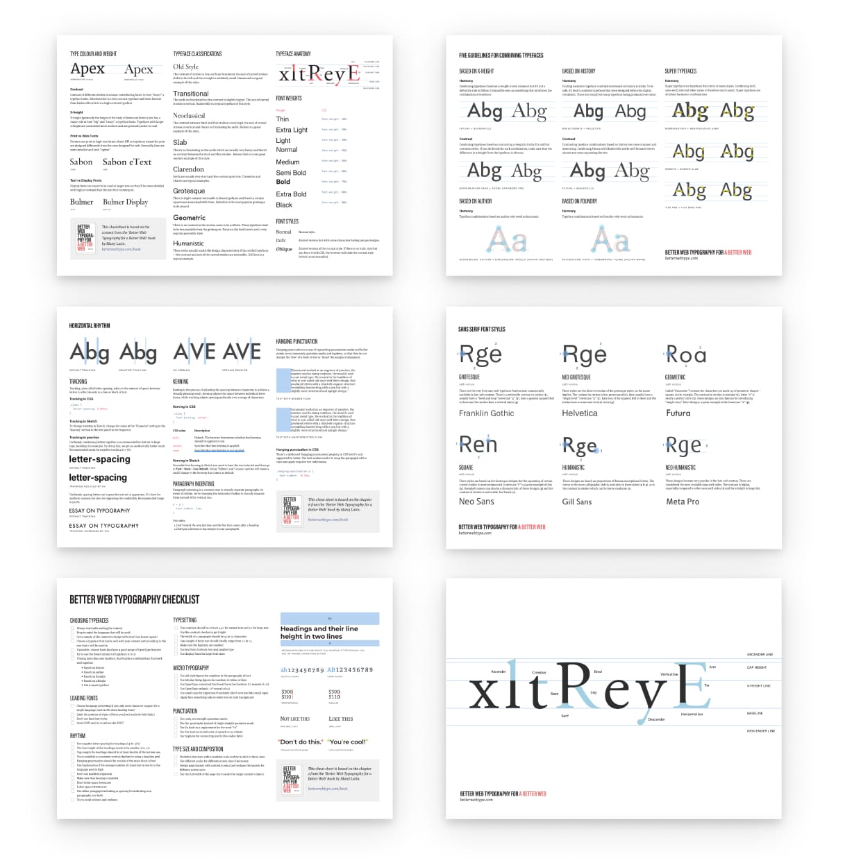
The psychology behind typeface choices plays a crucial role in how messages are perceived and how effectively they resonate with audiences. Fonts are not merely aesthetic choices; they evoke emotions and set the tone of the content. For instance, a serif typeface often conveys tradition and reliability, making it a popular choice for institutions and publications, while a sans-serif font exudes modernity and simplicity, ideal for tech brands and startups. Understanding these associations can empower content creators to select fonts that align with their brand identity and audience expectations.
Moreover, the legibility and readability of a typeface also significantly influence a reader's experience. Research suggests that fonts with distinct character shapes facilitate quicker recognition, thereby enhancing comprehension. Additionally, using varying font weights and sizes can guide readers through the hierarchy of information, making content more engaging. Ultimately, embracing the psychological impact of font choices ensures that messages not only capture attention but also foster a genuine connection with the audience.

Top 10 Eye-Catching Typefaces for Your Next Project
Choosing the right typeface can make or break your project, and with so many options available, it’s crucial to select one that captures attention and conveys your message effectively. Here are the Top 10 Eye-Catching Typefaces that will elevate your designs and leave a lasting impression:
- Montserrat: A modern sans-serif typeface with a geometric style, perfect for headings and promotional materials.
- Playfair Display: With its elegant serif structure, this typeface adds a touch of sophistication for editorial and branding purposes.
- Raleway: A sleek and versatile sans-serif font, great for both digital and print typography.
- Oswald: A reworking of the classic gothic typeface suitable for impactful headlines.
- Lora: A well-balanced serif typeface that brings a warm feeling to body text and is ideal for long articles.
- Be Vietnam: This modern sans-serif font offers a unique blend of style and readability, perfect for contemporary branding.
- Merriweather: Designed for readability, this serif typeface is perfect for web usage.
- Poppins: A geometric sans-serif typeface that stands out, making it ideal for logos and advertising.
- Amatic SC: A hand-drawn style that adds personality and charm, especially for creative projects.
- Source Serif Pro: A sophisticated serif font designed for clarity in digital formats, ensuring your content is always engaging.
How to Choose the Perfect Typeface That Grabs Attention
Choosing the perfect typeface is crucial for grabbing attention and enhancing the readability of your content. Start by identifying the purpose of your project; different types of typographic styles convey distinct messages. For instance, if you're designing for a playful brand, a modern, quirky typeface may be ideal, whereas a tech company might benefit from a sleek, sans-serif font. Consider using a combination of serif and sans-serif fonts to create contrast and visual hierarchy. It's also helpful to create a shortlist of typefaces that resonate with your brand identity, which sets the stage for making an informed decision.
Once you've narrowed down your options, evaluate how well each typeface communicates your message. Test the selected fonts in various sizes and formats to see how they perform in different contexts. Pay attention to the legibility of the typeface on screens and in print; readability is key to capturing your audience's attention. Don’t forget to consider the emotional impact — certain typefaces evoke feelings of warmth, urgency, or professionalism, which can influence how your message is perceived. By thoughtfully selecting the right typeface, you can create a memorable brand experience that resonates with your audience.